Colour Sets the Mood
Colour is one of the most powerful tools in interior design. It can make a room feel spacious or cosy, energetic or calm. Yet choosing the right palette is one of the most common challenges my clients face.
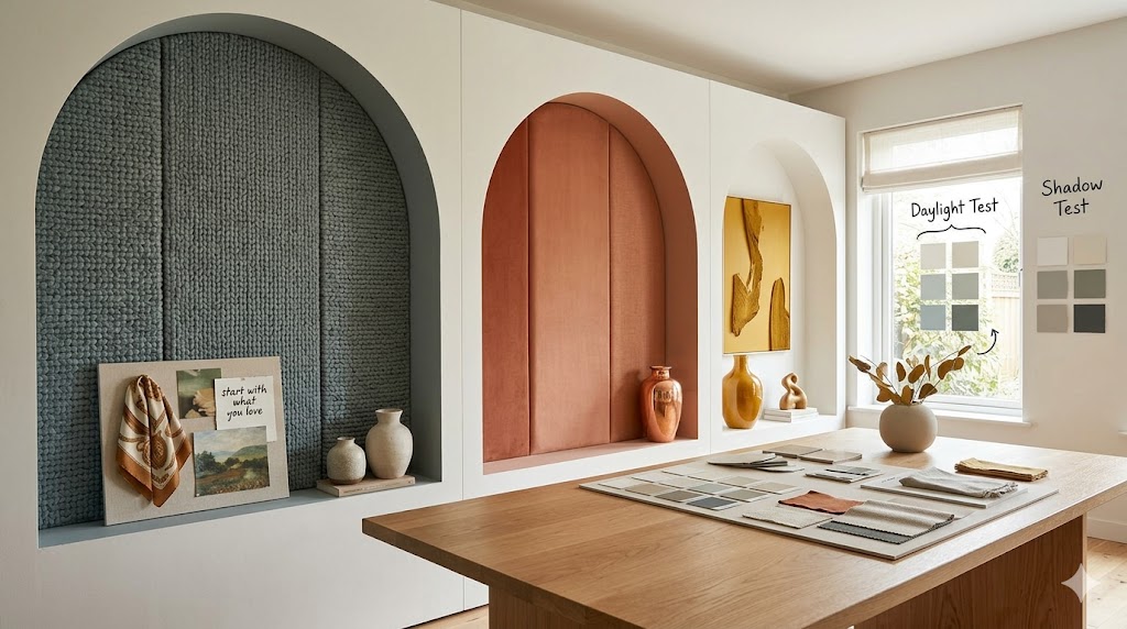
Start with What You Love
Look at your wardrobe, your favourite artworks, or even a photograph that makes you happy. These often hold clues to the colours that resonate with you most deeply.
Consider the Light
Natural light changes everything. A colour that looks perfect in a showroom may appear completely different in your north-facing living room. Always test paint samples in your actual space, observing them at different times of day.
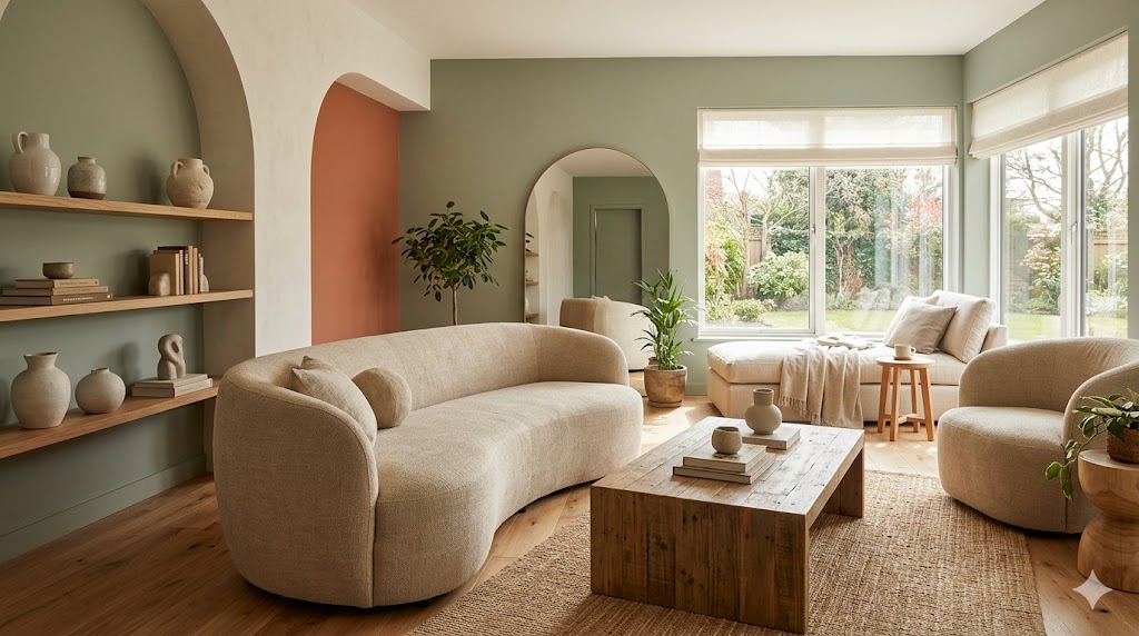
The 60-30-10 Rule
A classic approach that never fails: 60% dominant colour (walls, large furniture), 30% secondary colour (upholstery, curtains), and 10% accent colour (cushions, art, decorative objects). This creates visual balance without monotony.
Don't Forget Texture
Colour isn't just about hue — texture plays a crucial role too. A matte navy wall feels completely different from a glossy one. Mix textures within your palette to add depth and interest.
Remember, there are no wrong choices — only opportunities to express who you are through your space. If you need guidance, I'm here to help you find the palette that feels like home.